

GIS Monthly Spotlights
Each month, we create and share monthly spotlights that focus on topics impacting health+resilience in Texas communities. Follow us on social media to stay up to date on these spotlights!
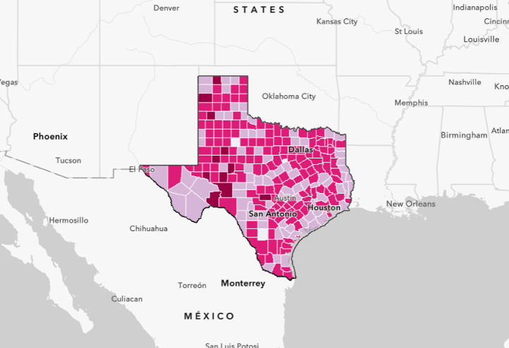
The 2019 Texas Community Resilience Dashboard shows the different levels of vulnerability to disasters and similar events such as pandemics at the county level in Texas. It also shows risk factor predominancy for each county and the relative level of vulnerability compared to the national estimates.
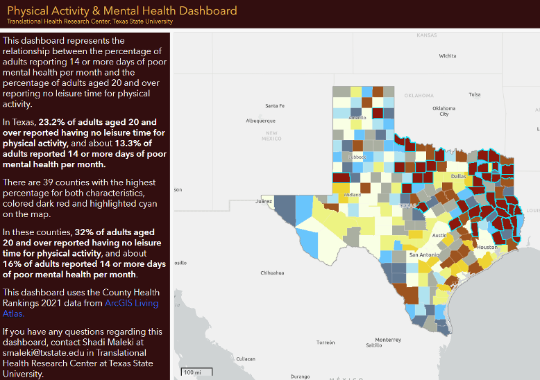
The Physical Activity & Mental Health Dashboard dashboard represents the relationship between the percentage of adults reporting 14 or more days of poor mental health per month and the percentage of adults aged 20 and over reporting no leisure time for physical activity.
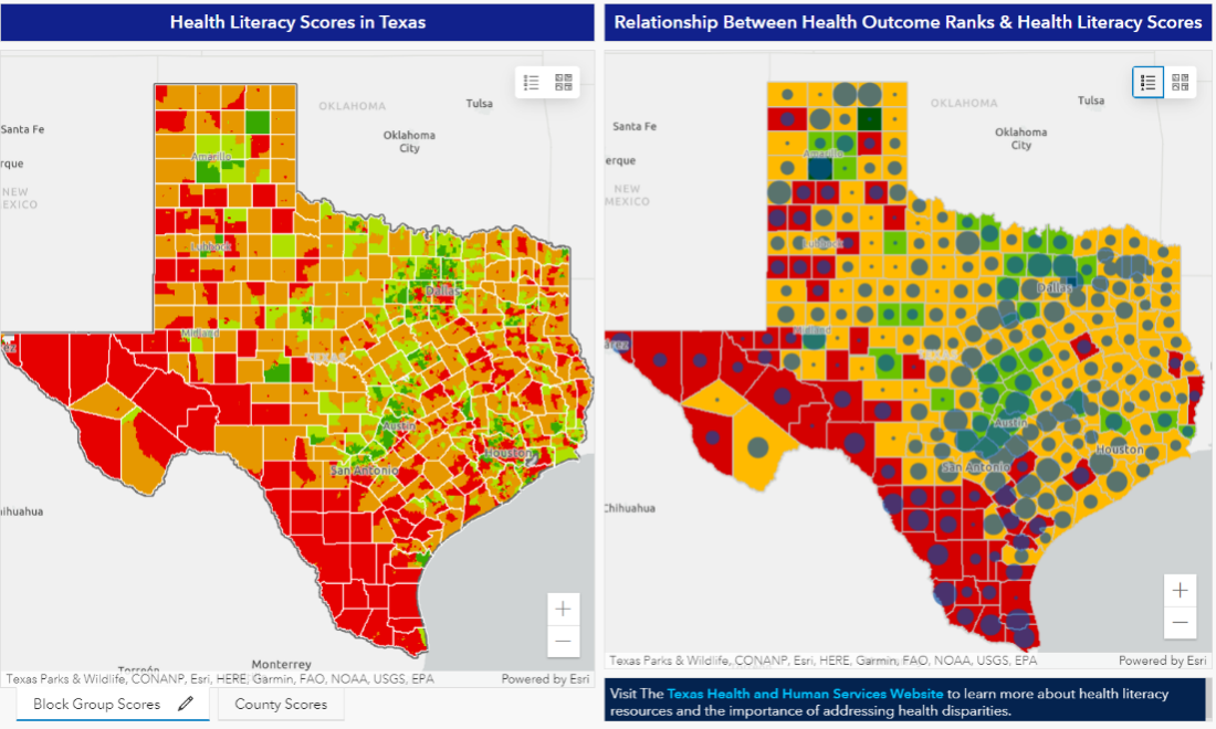
The Health Literacy Scores in Texas dashboard shows health literacy scores in Texas at the block group and county levels. It also includes a map that shows the relationship between health literacy scores and health outcome rankings.

This story map discusses food insecurity, access, and consumption in Texas counties.
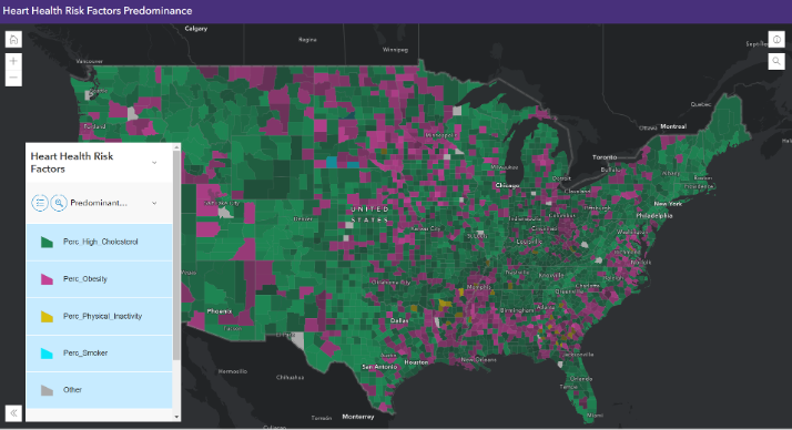
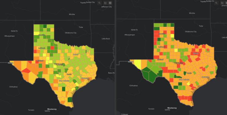
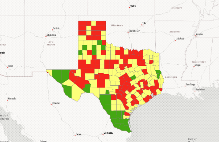
This web application shows the predominant risk factor for heart health in each county. The risk factors included in this map are high cholesterol, being overweight, physical inactivity, and smoking.
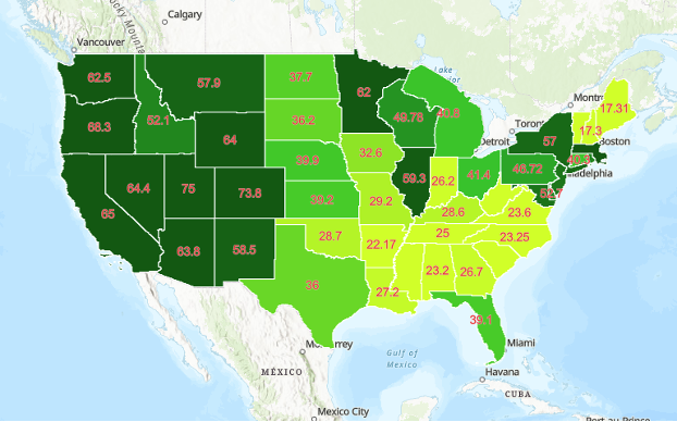
This map shows the percentage of people who live near a park. By clicking on each state, a table showing the prevalence of high blood pressure and coronary heart disease will open. It is possible to see an association between living close to a park and the prevalence of high blood pressure and coronary heart disease.
This dashboard shows the percent change in food insecurity and price per meal between 2019 and 2020 in Texas counties.
This map shows the percent change in excessive drinking between 2019 and 2022 in Texas counties.